Widgets
Widgets are the building blocks you place on a page. In edit mode, Edit with OpenBuild → Add widget… opens the picker; pick a type, set its appearance, and it drops into the page's grid. Each widget has a cog for its own configuration. Most widgets can be added more than once and configured differently each time.
Widgets fall into two groups: object widgets that read your app's data, and content widgets for text, media and navigation.
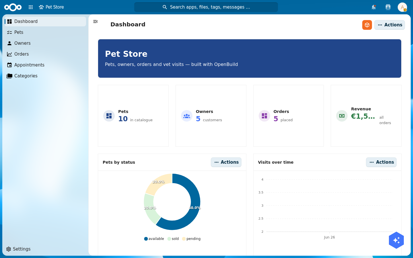
Gallery: a dashboard built from widgets
Every tile below is a widget configured in-app. This one dashboard from the Pet Store tutorial combines a header banner, four statistic cards, two charts, a gauge, a comparison/delta, an object list and an image — no code:
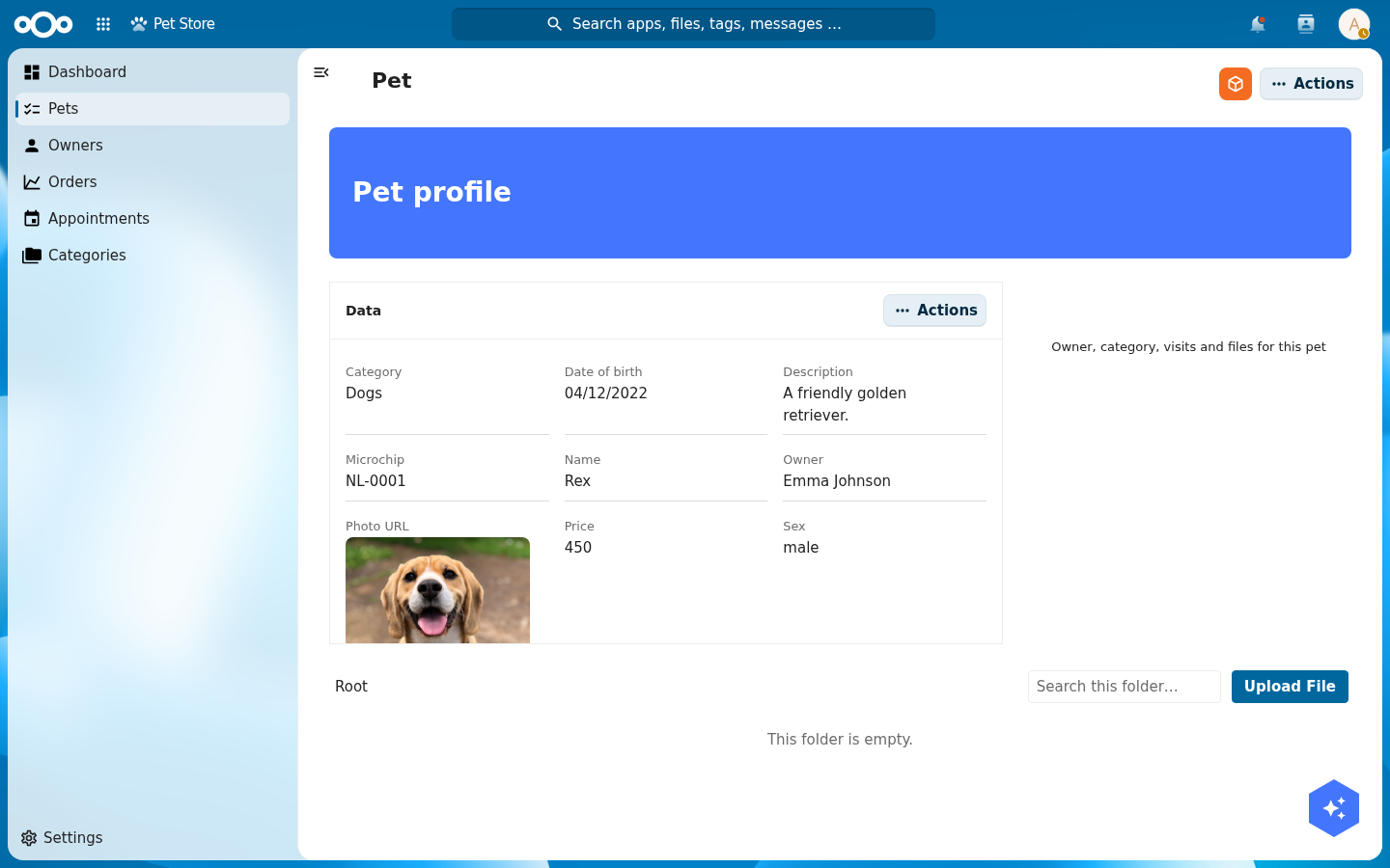
A detail page is the same idea bound to one object — a header, an Object data grid, a Files panel and an Object relations section:
Object widgets
These read from the page's object or a register/schema you point them at.
| Widget | What it shows | Configure |
|---|---|---|
| Object data | The current object's fields, as an editable data grid. | Which properties show, their order, layout (Stacked / 2-col / 3-col), per-field editor and editability. Inline click-to-edit; the same config drives the full edit form. |
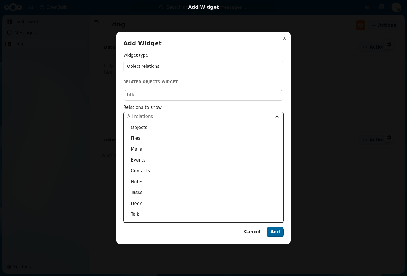
| Object relations | Everything linked to the object — related objects, files, and leaf integrations (mail, calendar, contacts, tasks, deck, …) — as tabs. | Relations to show: pick which relation groups appear. Add it several times to scope each to different relations. |
| Object list | A list/table of objects from a register + schema. | Register, schema, filter, sort, columns, limit. |
| Table | A tabular object list (alias of Object list for type:"table"). | Register, schema, columns, sort, limit. |
| Statistic / KPI | A single headline metric (count / sum / avg) over a register. | Data source, metric, label, icon. |
| Statistic card | A KPI card with a count and breakdown. | Data source, metric, variant, icon. |
| Comparison / delta | A metric vs. a previous period, with a delta. | Data source, metric, comparison window. |
| Gauge / utilization | A gauge for a value against a target/capacity. | Data source, value, max/target. |
| Chart | A bar/line/area chart bucketed over a register. | Chart kind, data source, bucket field/interval, metric. |
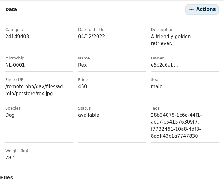
Object data
The default body of a detail page. Click the cog to choose exactly which fields
show and how they're laid out — hide id, show name and race stacked, and
so on. The same map drives both the inline display and the edit form.
Object relations
Aggregates the object's relations into tabs. Pick Relations to show to scope a widget to a subset — for example one widget for Objects + Files and another for Mails + Events — and add as many as you need.
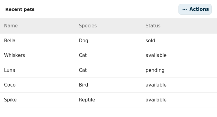
Object list
A list or table of objects from a register and schema, with the columns, sort and limit you choose:
Statistic / KPI
A single headline metric — a count, sum or average over a register — with a label and icon:

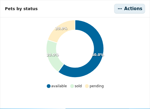
Chart
A bar, line, area or donut chart bucketed or grouped over a register:
Gauge / utilization
A gauge for a value against a target or capacity:

Comparison / delta
A metric compared against a previous period, with the change shown as a delta:

Content & layout widgets
These don't need data — they're for text, media, navigation and structure.
| Widget | What it is |
|---|---|
| Label | A short styled text label (font size, colour, weight, alignment). |
| Text | A rich text / paragraph block. |
| Header Banner | A page banner with title and styling. |
| Image | An image (uploaded or by URL). |
| Video | An embedded video. |
| Divider | A horizontal rule to separate sections. |
| Container | A grouping container for nesting widgets. |
| Tile | A quick-access tile with an icon and a link. |
| Links | A list of links. |
| Quicklinks | A compact quick-links grid. |
| Menu | A navigation menu block. |
| News | A news/announcements feed block. |
| Files | A files panel for the object or a folder. |
Header Banner
A full-width page banner with a title, subtitle and background styling:

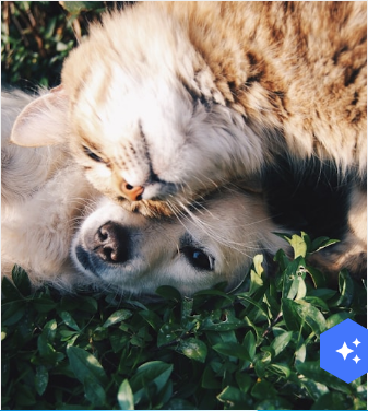
Image
An image, uploaded into Nextcloud Files or referenced by a same-origin URL:
Text
A rich-text / Markdown paragraph block:
Appearance (every widget)
The Add-widget dialog and each widget's cog share an Appearance section: show/hide the title, set a custom title, pick a background colour, and choose an icon. Widgets that bring their own title (like Object data and Object relations) hide the duplicate title field automatically.
Widgets placed via the manifest
A few widgets are rendered by the runtime but aren't offered in the Add-widget
picker because they have no in-app config form (they're wired through the
manifest or an integration): Calendar, People, Knowledge base
search, Nextcloud widget, Spend analytics, and Interaction form.
Integrations registered by other apps also surface here as integration
widgets. See the integrator guide.
Reference
- Build your app in-app — add and configure widgets in context.
- Integrator guide — register your own widgets and integrations.